Next-level investing

Pitch
Positioning
Verbal identity
Visual identity
Website strategy
Owning a category and elevated brand for an investing platform
This property investment platform with a unique co-investment model assured higher than average returns to its investors.
With an intriguing brand origin and unique competitive advantage to work with, we gave the brand a strong, strategic brand foundation, including category creation. The deep idea of being "next-level" inspired its visual identity that played with themes of elevation and rising to the clouds.
This was a rewarding project that showed how nailing the strategic and verbal elements led to a sophisticated visual brand.
Pitch
Our agency won the pitch in part due to the realization that they had partnered with several brands with names and identities inspired by ideas or objects from Japan. This gave us a point of reference to suggest ideas, expressions and explorations for the brand in advance.
The word Shojin comes from Japanese Buddhism, meaning disciplined effort towards a goal.


Positioning
I led on interviews with employees, customers and a team workshop to gain insights into what makes Shojin different and the value that is perceived from its approach to property investing.
We gave Shojin a defensible mental category to explain itself and use in its comms:
Shared Opportunity Investing
This was backed up with a clear-cut, easy theme about its investing approach: Next level investing


Verbal identity
I wrote high-level directional statements (Mission, Vision, etc) to articulate how Shojin aims to grow, for the encouragement of their team and the interest of investors.
As well as voice principles and other concepts to express the brand, I also created new values for the Shojin team to internalize, which was met with enthusiasm.
Finally, to package their approach and tie back to Shojin's mystical name, I coined The Shojin Way to give investment an air of sophistication.
But ultimately, everything stemmed from that core positioning to invest next level.


Visual identity
Verbal identity inspired visual.
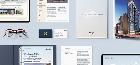
"Next level" unlocked motifs around clouds, high altitudes and the ends of sentences drifting upwards. We even expressed "next level" subtly in typography, such as the termini of letterforms having an rising slant to communicate progression.
A calming serene blue paired with earthy yellows and browns communicated property imbued with Buddhist idealism.

Website strategy
Shojin had complex financial products and different ways of making investments happen.
I developed a new sitemap and page architecture to fit everything that Shojin needed onto its site.
A new part of the site included more attention to the Shojin team and many of the new values and statements to give investors more confidence and insight into the people they would be partnering with.


